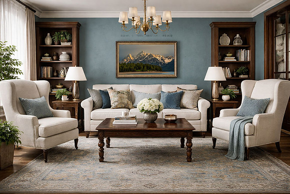
Decorating with Patina Blue: Etsy’s 2026 Color of the YearEtsy has officially named Patina Blue as its 2026 Color of the Year, and it’s easy to see why. Inspired by the way copper softens and evolves over time, Patina Blue reflects a quieter approach to design—one rooted in natural aging, character, and pieces that are meant to be lived in rather than replaced. This is not a bold, trend-driven blue. It’s a grounded, weathered tone that feels familiar, calm, and timeless. When paired with natural textures and intentional décor, Patina Blue creates interiors that feel both comforting and sustainable.
Why Patina Blue Works So Well at HomePatina Blue sits beautifully between blue and green, giving it a flexible, neutral quality. It brings a sense of calm without feeling cold and pairs naturally with materials already found in thoughtful, eco-conscious homes—wood, linen, stone, wool, and ceramics. Rather than demanding attention, this color creates a backdrop that allows other elements—light, texture, and artwork—to shine.
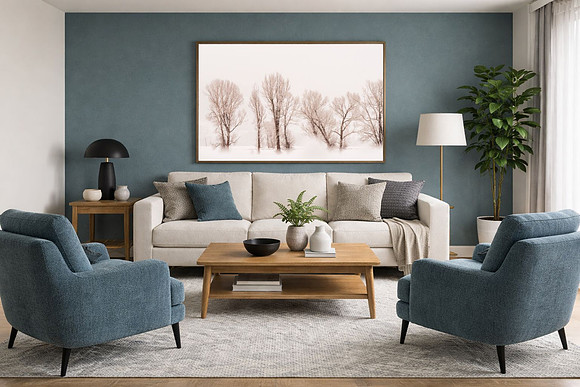
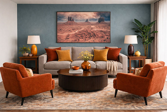
Comfortable Ways to Use Patina Blue1. Walls that feel lived-in, not loud 2. Textiles with purpose 3. Accent pieces over full saturation 4. Pair with warm, natural materials A Sustainable Color ChoicePatina Blue aligns naturally with slow living and sustainability. Its appeal comes from aging gracefully—just like linen that softens with use or wood that gains character over time. Choosing this color means designing a home meant to evolve, not chase trends. Instead of replacing décor every season, Patina Blue encourages thoughtful layering: quality textiles, meaningful artwork, and pieces that hold stories.
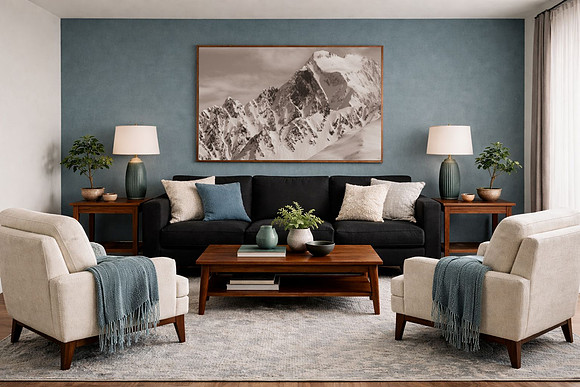
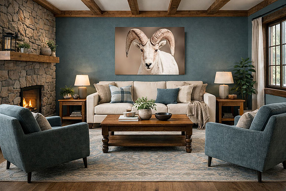
Photography Art That Pairs Beautifully with Patina Blue WallsNature photography is a perfect complement to this color palette. Patina Blue allows artwork to stand out while still feeling integrated into the space. From your collection, these types of images work especially well: 1. Moody Mountain LandscapesPhotographs featuring mist, snow-dusted peaks, or distant mountain ranges echo the quiet strength of Patina Blue. These pieces feel expansive and grounding—ideal for living rooms or bedrooms where calm is key. 2. Forest and Woodland ScenesImages with deep greens, soft light, and layered textures pair naturally with Patina Blue’s earthy undertones. Forest photography adds warmth and reinforces the connection to nature that this color represents. 3. Minimal Wildlife PortraitsWildlife photographs with simple compositions—neutral backgrounds, subtle contrast, and natural light—create a striking focal point without overwhelming the space. These work especially well in entryways, offices, or reading corners. For styling, natural wood frames, simple white mats, or soft black frames keep the focus on the artwork while complementing the wall color.
Bringing It All TogetherPatina Blue isn’t about making a statement—it’s about creating a feeling. When paired with washed linen textures, natural materials, and nature-inspired photography, it transforms a space into something calm, intentional, and deeply personal. This is a color for homes that value comfort over perfection and beauty that improves with time.
If these spaces resonate with you, you can explore more landscape and wildlife prints inspired by quiet places and natural light in my Etsy shop AngelaHopePhotos.etsy.com
Comments
No comments posted.
Loading...
|