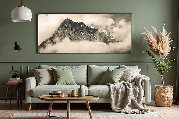
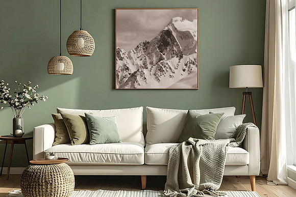
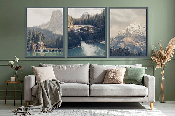
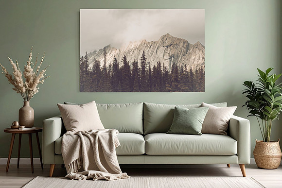
Sage Green: A Quiet Neutral Rooted in the Natural WorldSage green has been slowly taking the place of gray, not as a trend, but as a correction. Where gray can feel distant or cool, sage brings warmth without demanding attention. It settles into a space the way moss settles onto stone—softly, naturally, and with a sense of permanence. This isn’t a color chosen to impress. It’s chosen to calm. Inspired by weathered leaves, alpine grasses, and muted forest light, sage green works as a neutral because it behaves like one. It recedes when it needs to, supports other elements in the room, and never overwhelms. The result is a space that feels lived-in rather than styled. Why Sage Works Where Gray Falls ShortGray dominated interiors for years because it felt clean and flexible. Over time, it also began to feel flat. Sage green offers the same versatility with more depth. It reflects the outdoors in a way that feels grounding rather than decorative, making it especially well-suited for spaces meant for rest and focus. Sage pairs naturally with materials that already carry texture and history—wood, linen, stone, wool. These combinations don’t rely on contrast; they rely on harmony. The palette stays soft, but the room gains dimension. And while sage appears often in current design conversations, it isn’t tied to a moment. It’s a color that has existed in landscapes far longer than any design cycle, which is why it doesn’t date itself. Creating a Calm, Nature-Influenced SpaceUsed on walls, cabinetry, or even ceilings, sage creates an enveloping effect without closing a room in. It holds light gently, shifting throughout the day rather than staying static. Layering matters. Soft textiles, natural wood tones, and subtle variations in finish add richness without disrupting the calm. Texture does the work that bold color often tries to do—quietly. Accent colors work best when they echo natural elements: muted clay tones, warm neutrals, deep blues pulled from shadowed water or distant mountains. These additions add depth without competing for attention. Adding Meaning with Nature PrintsNature prints complement sage green not because they match it, but because they speak the same language. A landscape photograph or wildlife print introduces story and scale, giving the room a sense of place rather than decoration. Neutral-toned scenes maintain the softness of the space, while warmer wildlife or floral imagery adds subtle contrast. The goal isn’t a focal point that dominates—it’s a visual anchor that reminds you of the outdoors beyond the walls. Sage green doesn’t ask to be noticed. It supports a space the way nature supports us—quietly, steadily, and with lasting effect.
If this space resonates with you, you can explore more landscape and wildlife prints inspired by quiet places and natural light in my Etsy shop AngelaHopePhotos.etsy.com
Comments
No comments posted.
Loading...
|